
Responsive Website Design
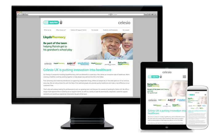
What looks good on your PC doesn't always look great on your mobile or tablet. With this in mind, in 2012 we led the charge by building all our sites responsively from that point on. We are determined to make sure candidates have an excellent user experience, regardless of the device they are using.
To make this a reality, we use all the latest technologies, including HTML5 and a variety of languages, frameworks and content management systems, all helping keep the sites we build scalable and relevant. So you can be sure we’ll make you look your best online, whether it’s a full careers site, campaign or microsite.
We'll also give you access to a range of tracking tools that give visibility of visitor behaviour, including their journey through the site and where they are coming from. You can even watch live recordings of how people interact with the different pages and functionality!
With more and more candidates opting to job hunt via mobile, having a responsively designed website is more crucial than ever.